
Visual Identity
The briefs main focus was to think about social media in a business like way and to have a future-focused approach. I needed to apply this to The Heaven Company both online and print-based. As a result of challenging the conventional business stationery, I hope students will find it fun and engaging. I have thoroughly considered the visual identity of the company and experimented with creating persistent recognition.
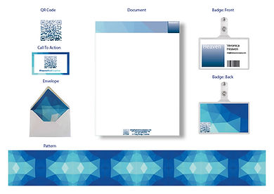
I focused on the fact that the existing Heaven Company logo is faded blue. I wanted the gradual fade to remain as a theme throughout as this represents the concept of development from starting with nothing and becoming something. So this relates directly to The Heaven Company as they provide advice to other businesses to help them achieve expertise and long-term benefit, this development is vital. I created a logo in the form of a digital globe which is faded blue with white lines running through to show the communication between The Heaven Company and other
businesses. Also, the globe itself demonstrates how the company has the potential to become worldwide. However, we decided perhaps this is too futuristic and perhaps a bit literal.
I have stuck with the original logo but again taken the faded concept as a theme and have created a pattern consisting of triangular polygons. This was our final design which will be used for all of our print-based aspects. We aim to support and promote
the social profiles we have created by using a QR code on all of the stationery and this will take you directly to the main website.